Posted by Axel McCarthy
Globally, about 80% of traffic to IndieMade sites comes from traditional desktop computers. But of course that means that one fifth of our traffic comes from mobile devices -- tablets and phones -- and that percentage is rising.
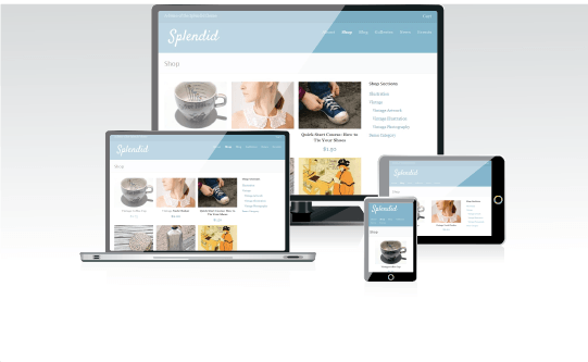
Last week we released Splendid, a new responsive theme that's available to all IndieMade sites. "Responsive" is a techie term that means the site adjusts itself to the screen dimensions of the user viewing the site. For example, Splendid's standard store view has three columns of product images. But view it on a tablet in portrait mode (held like a book, taller than it is wide) and you might get only two columns. Use your smartphone to view the site, and you only see a single column of products, with the product categories all the way at the bottom. It's pretty slick.

But we're also excited about Splendid because it's a great looking theme in its own right. It uses all the horizontal space it can for gallery images, so it's great for portfolio or artist sites. Products with more than one image get a slick scrolling view. Contact and checkout forms look great, comments pick up user pictures via gravitar, and it's got the same changeable abstract background that makes Edifice so popular. And of course you can change fonts, colors, thumbnail styles, and so on, just like you can in every IndieMade theme. All in all, we're thrilled to add it to our theme stable.
Check out the Splendid demo site to give it a whirl, or just log into your dashboard and select it at design > themes to apply it to your own site.


