Posted by Cynthia Boris
Spring is a time of change and renewal and it’s the perfect time to refresh the offerings in your online store. The best place to start is with the fashion and designs for 2017. Your customers have read about these trends on Elle, Vogue, and House Beautiful. They’ve send them on Instagram and Pinterest. They’ve actively looking to add these fresh touches to their home and wardrobe so why not give them what they’re asking for.
Spring Color Trends
The easiest way to update your offerings for Spring is to feature some of the trending colors. Pantone is the company that we turn to for such matters and they never let us down. They say this season’s top colors are a mix of “vitality, relaxation and the great outdoors.” 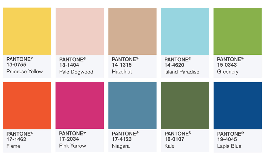
Here are their top picks:
-
PANTONE 17-4123 Niagara: Comfortable and dependable, Niagara leads the PANTONE Fashion Color Report as the most prevalent color for spring 2017. Niagara is a classic denim-like blue that speaks to our desire for ease and relaxation.
-
PANTONE 13-0755 Primrose Yellow: By contrast, Primrose Yellow sparkles with heat and vitality. Inviting us into its instant warmth, this joyful yellow shade takes us to a destination marked by enthusiasm, good cheer and sunny days.
-
PANTONE 19-4045 Lapis Blue: Conveying even more energy is Lapis Blue. Strong and confident, this intense blue shade is imbued with an inner radiance.
-
PANTONE 17-1462 Flame: A red-based orange, Flame, is gregarious and fun loving. Flamboyant and vivacious, this wonderfully theatrical shade adds fiery heat to the spring 2017 palette.
-
PANTONE 14-4620 Island Paradise: Island Paradise is a refreshing aqua that calls to mind a change of scenery. A cool blue green shade that speaks to our dream of the great escape, Island Paradise is emblematic of tropical settings and our desire to unwind.
-
PANTONE 13-1404 Pale Dogwood: Continuing the tranquil mood, Pale Dogwood is a quiet and peaceful pink shade that engenders an aura of innocence and purity. The unobtrusive Pale Dogwood is a subtle pink whose soft touch infuses a healthy glow.
-
PANTONE 15-0343 Greenery: Bringing forth a refreshing take, Greenery is a tangy yellow-green that speaks to our need to explore, experiment and reinvent. Illustrative of flourishing foliage, the fertile attributes of Greenery signals one to take a deep breath, oxygenate and reinvigorate.
-
PANTONE 17-2034 Pink Yarrow: Tropical and festive, Pink Yarrow is a whimsical, unignorable hue that tempts and tantalizes. Bold, attention getting and tempestuous, the lively Pink Yarrow is a captivating and stimulating color that lifts spirits and gets the adrenaline going.
-
PANTONE 18-0107 Kale: Evocative of the great outdoors and a healthy lifestyle, Kale is another foliage-based green that conjures up our desire to connect to nature, similar to the more vivacious Greenery. And, just as we see in nature, this lush and fertile natural green shade provides the perfect complementary background to the more vibrant tones in the palette.
-
PANTONE 14-1315 Hazelnut: Rounding out the spring 2017 colors is Hazelnut, a key neutral for spring. This shade brings to mind a natural earthiness. Unpretentious and with an inherent warmth, Hazelnut is a transitional color that effortlessly connects the seasons.
April Showers Bring. . .
Pantone sets the color balance, but for the final word on prints, we look to the designers that showed at New York Fashion Week. It’s not surprise that floral prints are in for Spring, but not just any florals; designers like Balenciaga, Gucci, and Dolce & Gabbana all went with bold and bright floral prints. Think full on 70’s flower power – the bigger the better.
Totally 80’s
Several top designers channeled their inner Material Girl for Spring 2017. Models walked the runway in metallic materials, glitter gowns, and dresses with what Elle calls “the Flashdance shoulder”. Designers also played with color blocking, racing flag checkerboard patterns and wide, wide stripes. Overall, if it’s wild and bold, it’s in.
Shapes and Sizes
Long and flowing blouses, dressed and over shirts are also hot for Spring. A few designers cut the bulk by adding a tight corset to cinch in the waist but others let it flow. Slouchy trenchcoats have made a comeback but what’s really hot is wearing a bathrobe as a coat! No kidding, Elle says it’s the height of fashion.
One last trend in the shape category is asymmetrical sashes that run from shoulder to hip. Some are built into the garment but you can also achieve the look with a long scarf. Keep that one in mind if you’re a knitter!
Staying Home
If you lean more toward interior design than fashion design, here’s the latest in home trends.
It all starts with those same earthy pastel hues that Pantone recommends. From there, it’s a dash of mixed metals including nickel and copper (House Beautiful says it’s the metal of the year). The wildest new trend is white plaster. It’s a modern take on an old look which is another trend for Spring. If you can update a piece of vintage furniture, you’ll be right on top.
House Beautiful says that marble wallpaper, wood tiles and climbing vines are showing up in homes all across the US. They also say that Farmhouse or Country Chic will remain a popular style of decorating for every room in the house.
There you have it, the top trends for Spring 2017. Pick one or two that appeal to you and think about how you can incorporate these ideas into your current line. Almost any handmade seller can work in the Pantone colors of the year. If you’re a jewelry designer, work up a few new pieces in the bold and quirky 80’s style. If fine art is your gig; what can you paint that will fit beautifully into a farmhouse style bedroom?
Remember, trends come and go, so it’s not about making large changes in your brand, it’s just about adding fresh new touches that will excite and delight customers from now until the world changes direction again for Fall 2017.